
The Yoga
The Yoga
The Yoga
Go beyond the mat: A holistic yoga companion for wellness, mindfulness, and community.
“The Yoga” is the perfect self care accountability partner that knows how to communicate the yoga principles to the reality we exist in today.
Year
2023
Role
Designer & Researcher
Timeframe
8-weeks
Overview
Overview
Overview
Yoga is represented as a practice with many benefits for one’s overall well being but is often misconceived due to the perception of what yoga represents. Many people think it's either hard or they feel left out because of what they see on social media or in a yoga studio. Studies also show that many people find yoga to be inaccessible and not inclusive to their communities, which create multiple barriers that deter people from practicing yoga. Personally yoga has done a lot for me which is what inspired me to develop “The Yoga.”
Yoga is represented as a practice with many benefits for one’s overall well being but is often misconceived due to the perception of what yoga represents. Many people think it's either hard or they feel left out because of what they see on social media or in a yoga studio. Studies also show that many people find yoga to be inaccessible and not inclusive to their communities, which create multiple barriers that deter people from practicing yoga. Personally yoga has done a lot for me which is what inspired me to develop “The Yoga.”
Yoga is represented as a practice with many benefits for one’s overall well being but is often misconceived due to the perception of what yoga represents. Many people think it's either hard or they feel left out because of what they see on social media or in a yoga studio. Studies also show that many people find yoga to be inaccessible and not inclusive to their communities, which create multiple barriers that deter people from practicing yoga. Personally yoga has done a lot for me which is what inspired me to develop “The Yoga.”
Challenge
Challenge
Challenge
Traditional yoga often falls short of inclusivity. Beginners feel intimidated, seniors fear injury, and busy individuals struggle to find time. The lack of affordable options and supportive communities further restricts access to the health and wellness benefits of yoga.
Traditional yoga often falls short of inclusivity. Beginners feel intimidated, seniors fear injury, and busy individuals struggle to find time. The lack of affordable options and supportive communities further restricts access to the health and wellness benefits of yoga.
Traditional yoga often falls short of inclusivity. Beginners feel intimidated, seniors fear injury, and busy individuals struggle to find time. The lack of affordable options and supportive communities further restricts access to the health and wellness benefits of yoga.
Research
Research
Research
To unearth the true struggles of aspiring yogis, I dived deep with surveys, interviews, and empathy mapping. I wanted to see the full picture: their initial anxieties, common hiccups, and creative solutions they envisioned. Secondary research confirmed my suspicions: yoga's image often alienates diverse bodies and backgrounds, leaving many feeling judged and unsure where to begin. This ignited my mission to create a practice welcoming to all, regardless of ability, identity, or physique.
Interviews
Participants were recruited with screener surveys and interviews were done remotely through zoom. To gain understanding of how to improve the yoga experience, I conducted 5 interviews with people who practice yoga regularly or want to start. I learned about pain points and motivations in order to better understand the problem. We discussed information on what yoga meant to them, mental and physical health and reasons as to why they don’t practice or never have.
Affinity Maps
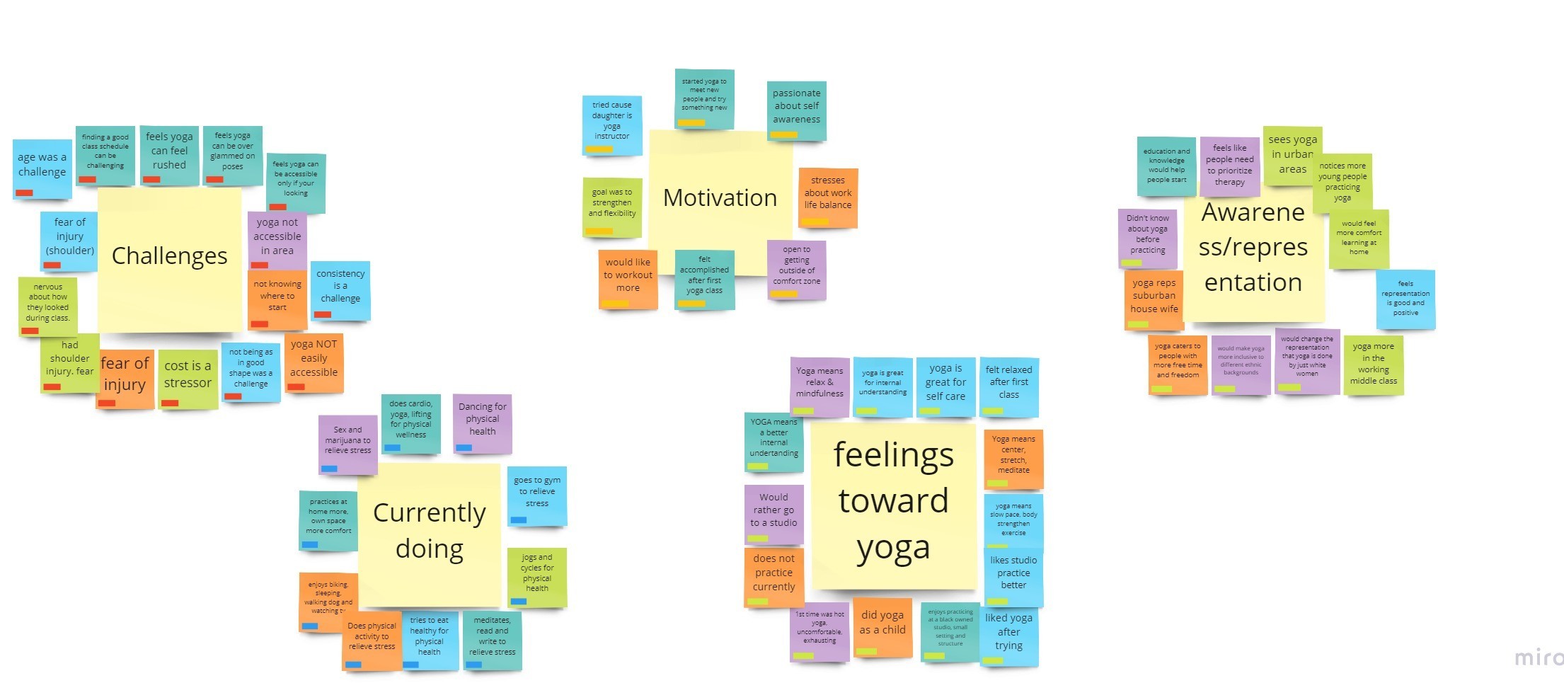
Affinity mapping was a big part of this project because it helped to better understand users and their needs. Creating the affinity map also helped with planning product features for the future and to define product requirements. I was able to reveal that most people have the goal of relieving some type of stress but feel yoga is just for physical and not mental wellness.
With the information I gathered, I created 5 themes: Challenges, currently doing, motivation for starting, representation / awareness, and feelings towards the subject of yoga.
Empathy Maps
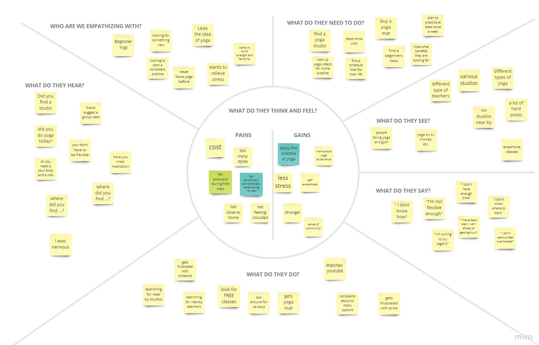
To better understand the user's frame of mind, I created an empathy map for 2 types of users: (1) The beginner & (2) The Restarter. The Empathy map brought clarity to the emotions a user may feel when searching for a resource to start a yoga practice.
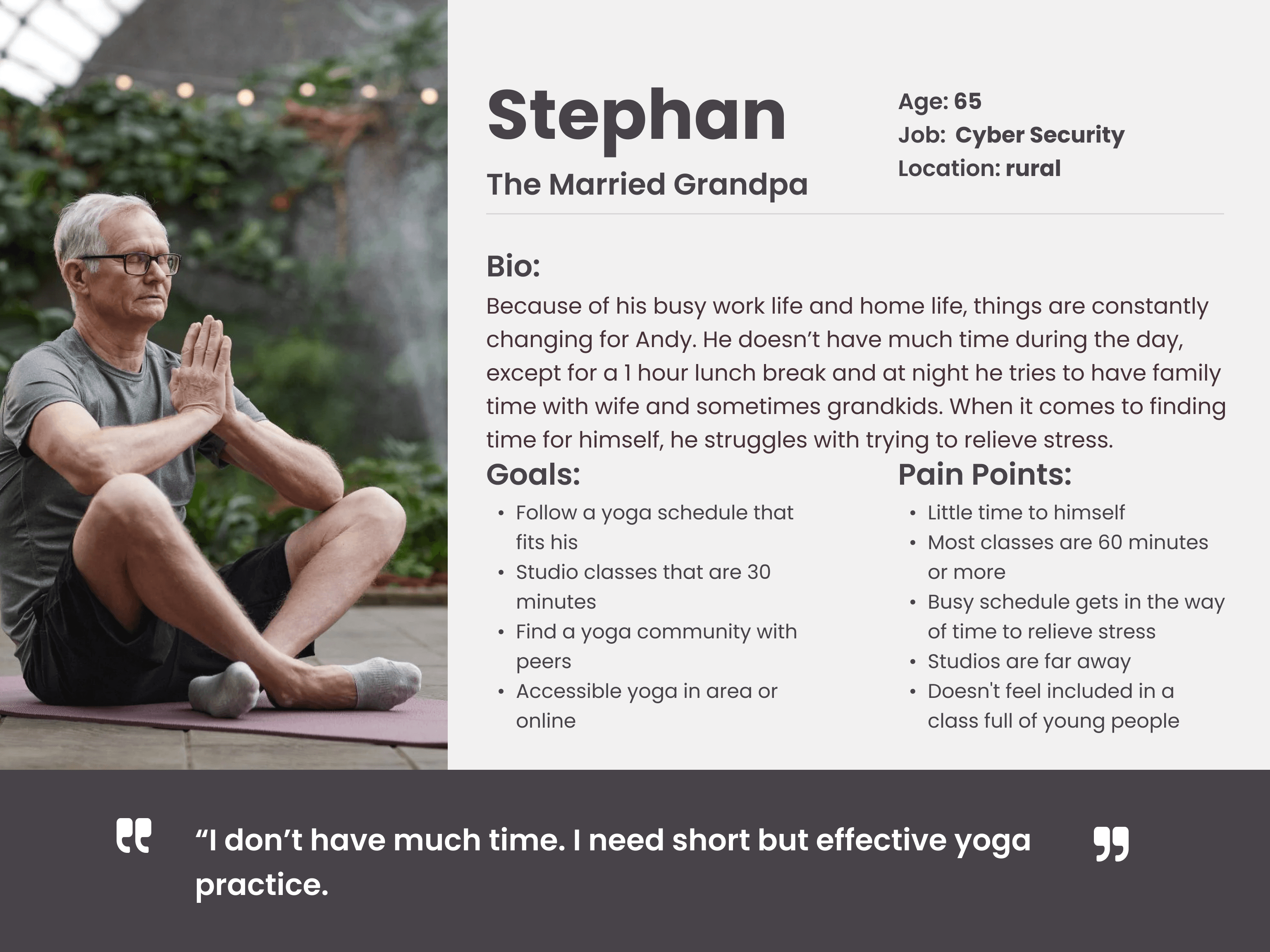
Personas
After pinpointing the types of users, I developed 2 personas to help with creating a solution. Taking the notes from the empathy maps, I created these personas to help with ideas on the types of features that we should include in the application.
To unearth the true struggles of aspiring yogis, I dived deep with surveys, interviews, and empathy mapping. I wanted to see the full picture: their initial anxieties, common hiccups, and creative solutions they envisioned. Secondary research confirmed my suspicions: yoga's image often alienates diverse bodies and backgrounds, leaving many feeling judged and unsure where to begin. This ignited my mission to create a practice welcoming to all, regardless of ability, identity, or physique.
Interviews
Participants were recruited with screener surveys and interviews were done remotely through zoom. To gain understanding of how to improve the yoga experience, I conducted 5 interviews with people who practice yoga regularly or want to start. I learned about pain points and motivations in order to better understand the problem. We discussed information on what yoga meant to them, mental and physical health and reasons as to why they don’t practice or never have.
Affinity Maps
Affinity mapping was a big part of this project because it helped to better understand users and their needs. Creating the affinity map also helped with planning product features for the future and to define product requirements. I was able to reveal that most people have the goal of relieving some type of stress but feel yoga is just for physical and not mental wellness.
With the information I gathered, I created 5 themes: Challenges, currently doing, motivation for starting, representation / awareness, and feelings towards the subject of yoga.
Empathy Maps
To better understand the user's frame of mind, I created an empathy map for 2 types of users: (1) The beginner & (2) The Restarter. The Empathy map brought clarity to the emotions a user may feel when searching for a resource to start a yoga practice.
Personas
After pinpointing the types of users, I developed 2 personas to help with creating a solution. Taking the notes from the empathy maps, I created these personas to help with ideas on the types of features that we should include in the application.
How Might We...
How Might We...
How Might We...
Problem Statements
The how might we statements was helpful to come up with ideas on how to solve multiple problems that the user may face. I utilize the information from the affinity maps, empathy maps and personas to create the following how might we statements:
How might we make users feel confident they are joining the right yoga class for their needs?
How might we increase the awareness of the full benefits of yoga to users?
How might we support users with a payment process that is cost effective?
How might we make the scheduling process easy and flexible?
How might we make users feel seen and included in a yoga class?
How might we relieve the overwhelming feeling users have when trying to start yoga for the first time?
Site Map
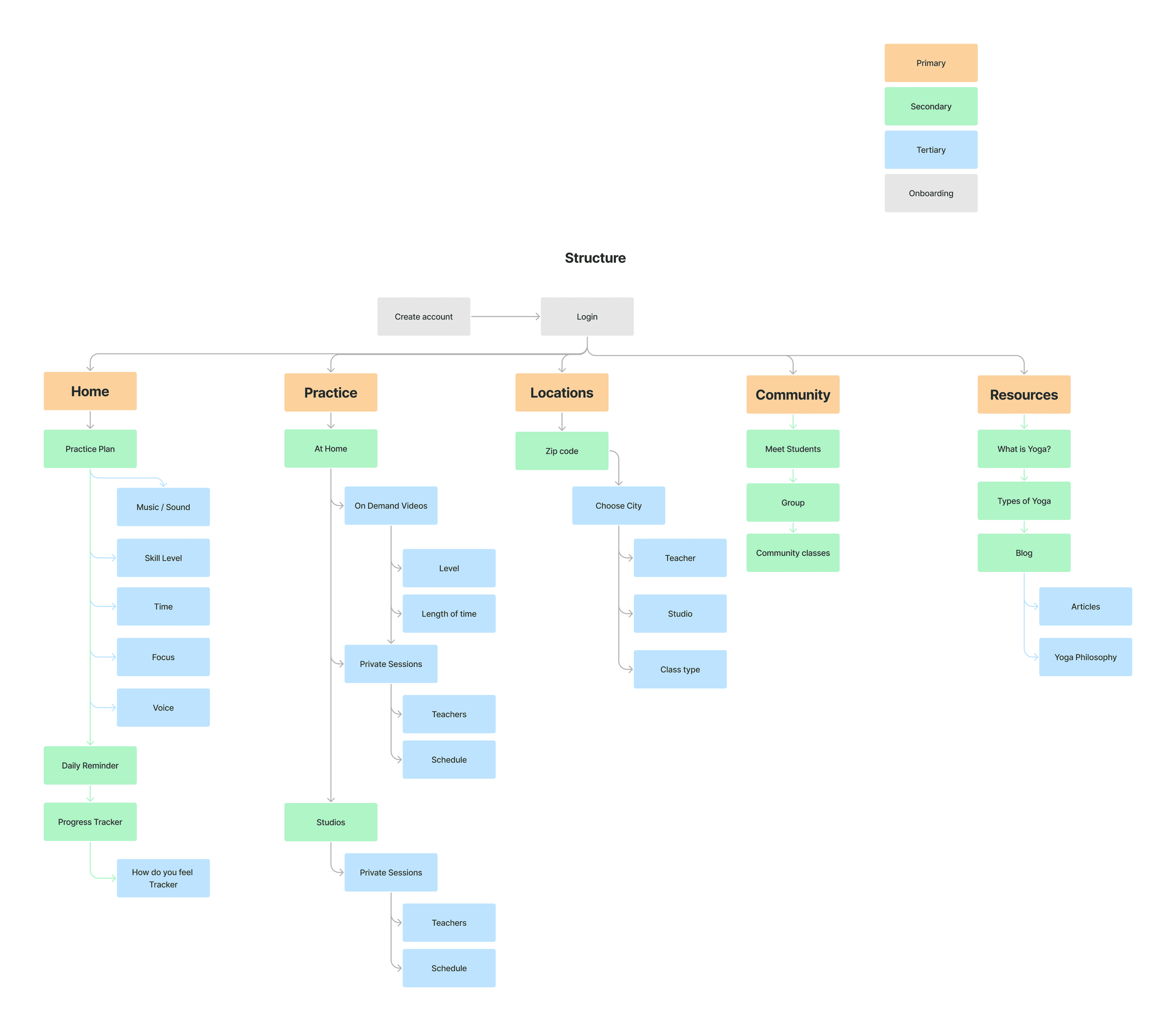
The sitemap helped with laying out the rough draft of the navigation of my application. My sitemap has a simple style that will be easy for navigation.
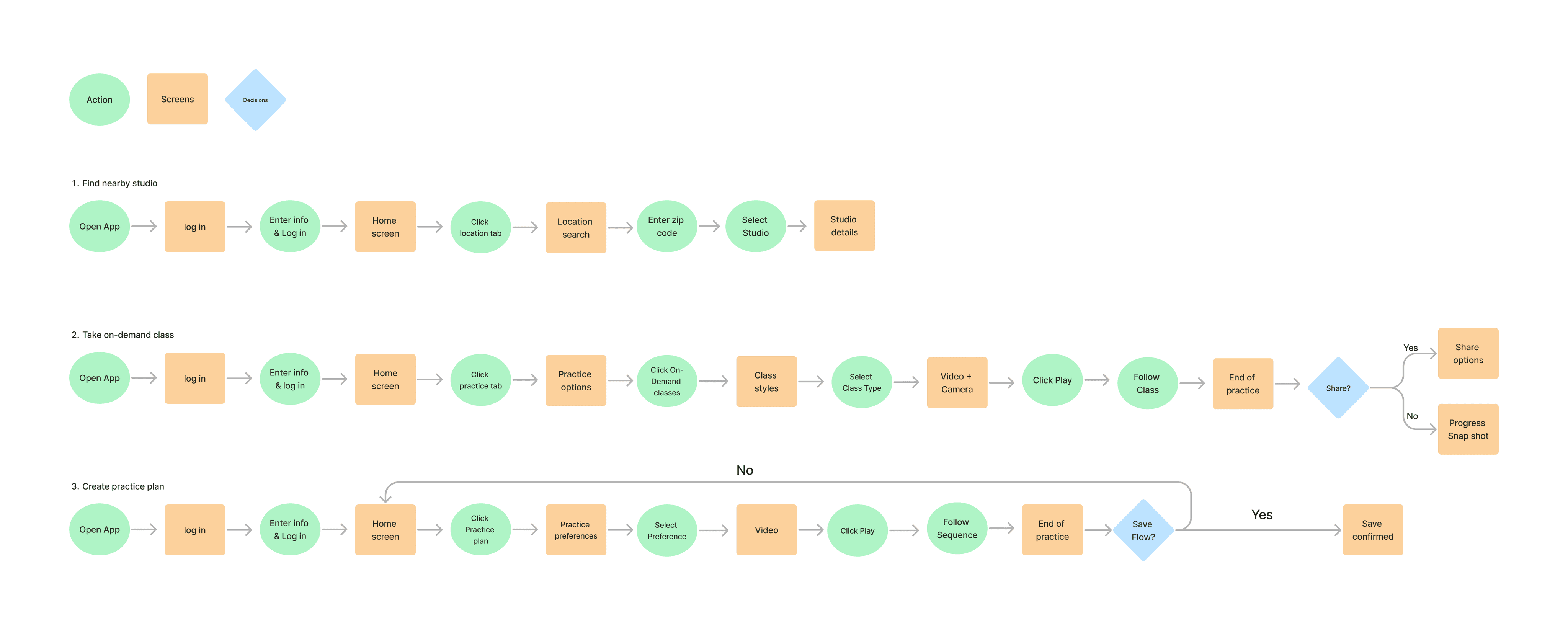
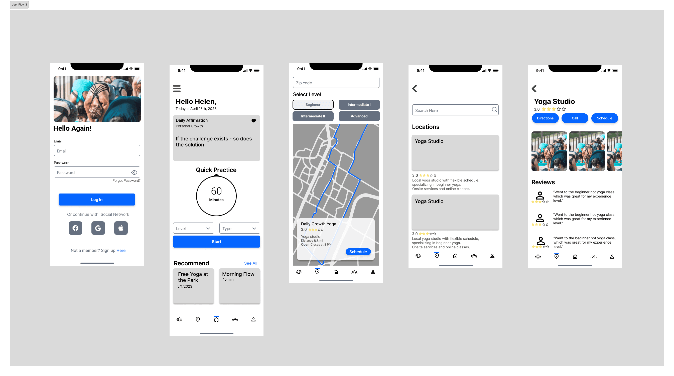
User Flows
After the research and conduction interviews, I discovered that having easy access to yoga and a recommended plan were important in starting a yoga practice. These challenges help me identify three user flows. The goal is to encourage and empower users by giving them a way to find a yoga studio nearby or practice in the comfort of their own home. I created actions and screens for each user flow.
Problem Statements
The how might we statements was helpful to come up with ideas on how to solve multiple problems that the user may face. I utilize the information from the affinity maps, empathy maps and personas to create the following how might we statements:
How might we make users feel confident they are joining the right yoga class for their needs?
How might we increase the awareness of the full benefits of yoga to users?
How might we support users with a payment process that is cost effective?
How might we make the scheduling process easy and flexible?
How might we make users feel seen and included in a yoga class?
How might we relieve the overwhelming feeling users have when trying to start yoga for the first time?
Site Map
The sitemap helped with laying out the rough draft of the navigation of my application. My sitemap has a simple style that will be easy for navigation.
User Flows
After the research and conduction interviews, I discovered that having easy access to yoga and a recommended plan were important in starting a yoga practice. These challenges help me identify three user flows. The goal is to encourage and empower users by giving them a way to find a yoga studio nearby or practice in the comfort of their own home. I created actions and screens for each user flow.
Solution
Solution
Solution
The Yoga is the perfect self care accountability partner that knows how to communicate the yoga principles to the reality we exist in today. Encouraging one to pay more attention to themselves through movement and meditation. The Yoga app provides a connection with all people, no matter the age, demographic, body type or group. Users will be able to start a mindful yoga practice with ease
The Yoga is the perfect self care accountability partner that knows how to communicate the yoga principles to the reality we exist in today. Encouraging one to pay more attention to themselves through movement and meditation. The Yoga app provides a connection with all people, no matter the age, demographic, body type or group. Users will be able to start a mindful yoga practice with ease
The Yoga is the perfect self care accountability partner that knows how to communicate the yoga principles to the reality we exist in today. Encouraging one to pay more attention to themselves through movement and meditation. The Yoga app provides a connection with all people, no matter the age, demographic, body type or group. Users will be able to start a mindful yoga practice with ease
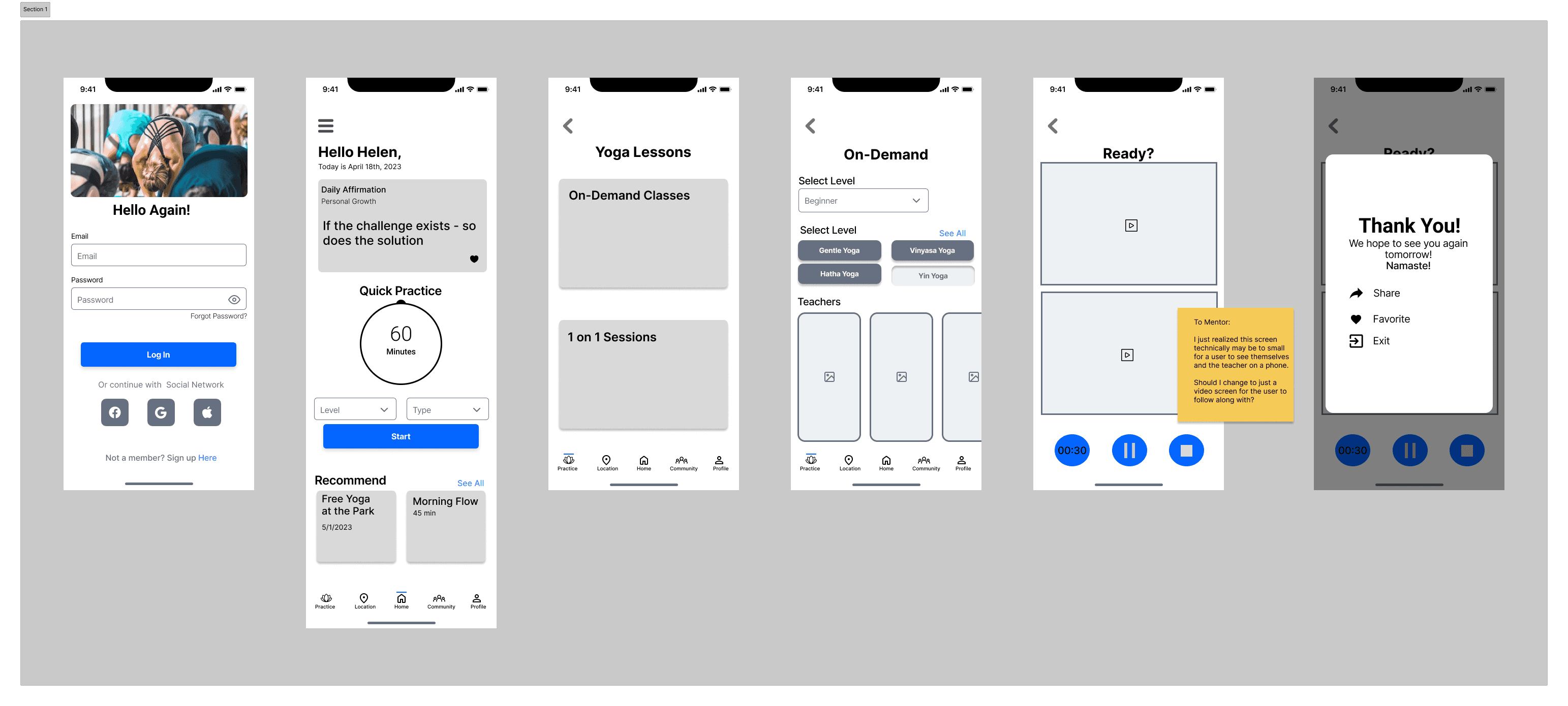
Wireframes & Prototypes
Wireframes & Prototypes
Wireframes & Prototypes
Translating sketches into Figma wireframes, I laid the foundation for my app's experience. Playful details like image placeholders and buttons filled the screens, while I tackled dynamic elements like scrolling and modals, eager to master the craft.
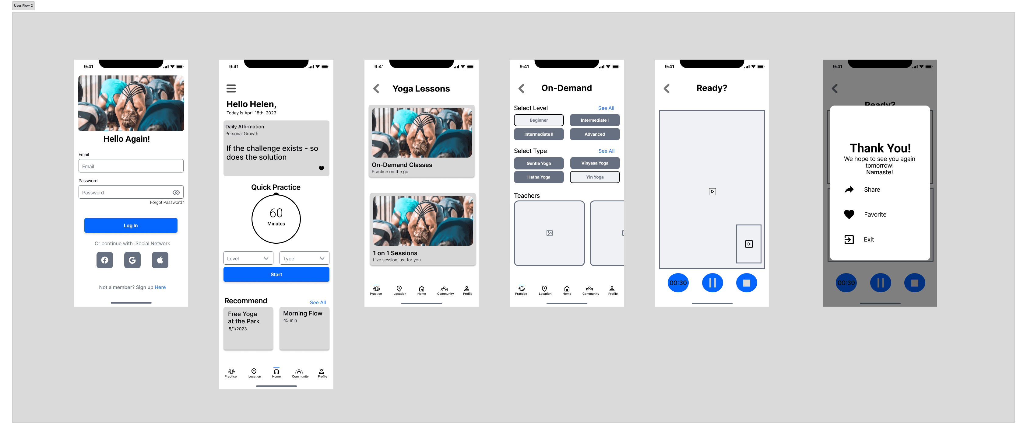
High Fidelity & Prototype
Polished to perfection: Iterative testing of high-fidelity screens honed visuals and text hierarchy, ensuring user confidence and effortless navigation. Simplicity and clarity reigned supreme. Prototyping in Figma brought my vision to life, enabling seamless interactions between buttons, links, cards, and more. User flows transformed into navigable experiences, aligning perfectly with my testing plan.
Prototype Here!!
Usability Testing
Remote moderated usability tests were conducted with 5 participants, who were asked to:
Find a nearby studio
Start a practice
Create a yoga plan.
I was hoping to discover that the application would be easy to navigate to begin a yoga practice, while hypothesizing the user may struggle with creating a plan and the terminology.
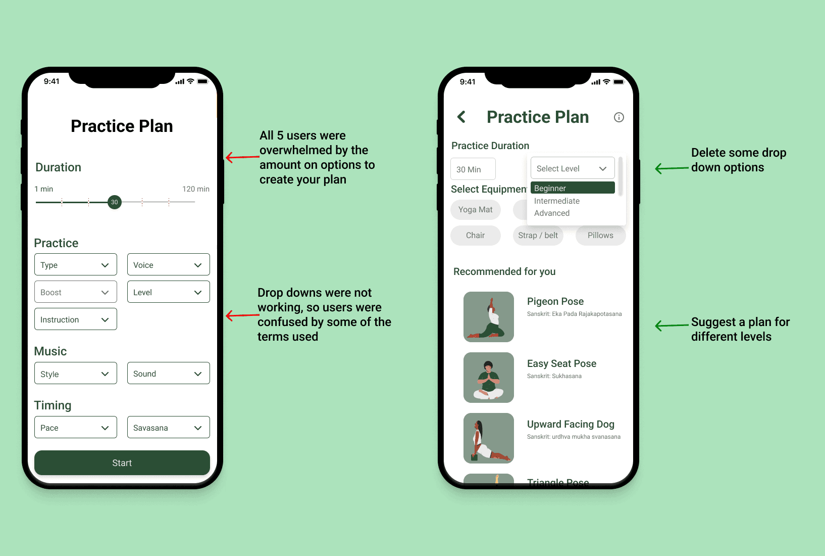
Issue #1
Too many options on creating your own plan screen.
Summary:
All 5 users were overwhelmed by the amount on options to create your plan
Drop downs were not working, so users were confused by some of the terms used
As a beginner, the user did not know how to create the plan
Recommendations:
Delete some drop down options
Suggest a certain plan for different levels
Suggest a certain plan for different body parts (Hips, back, knees, etc.)
Add information rollovers
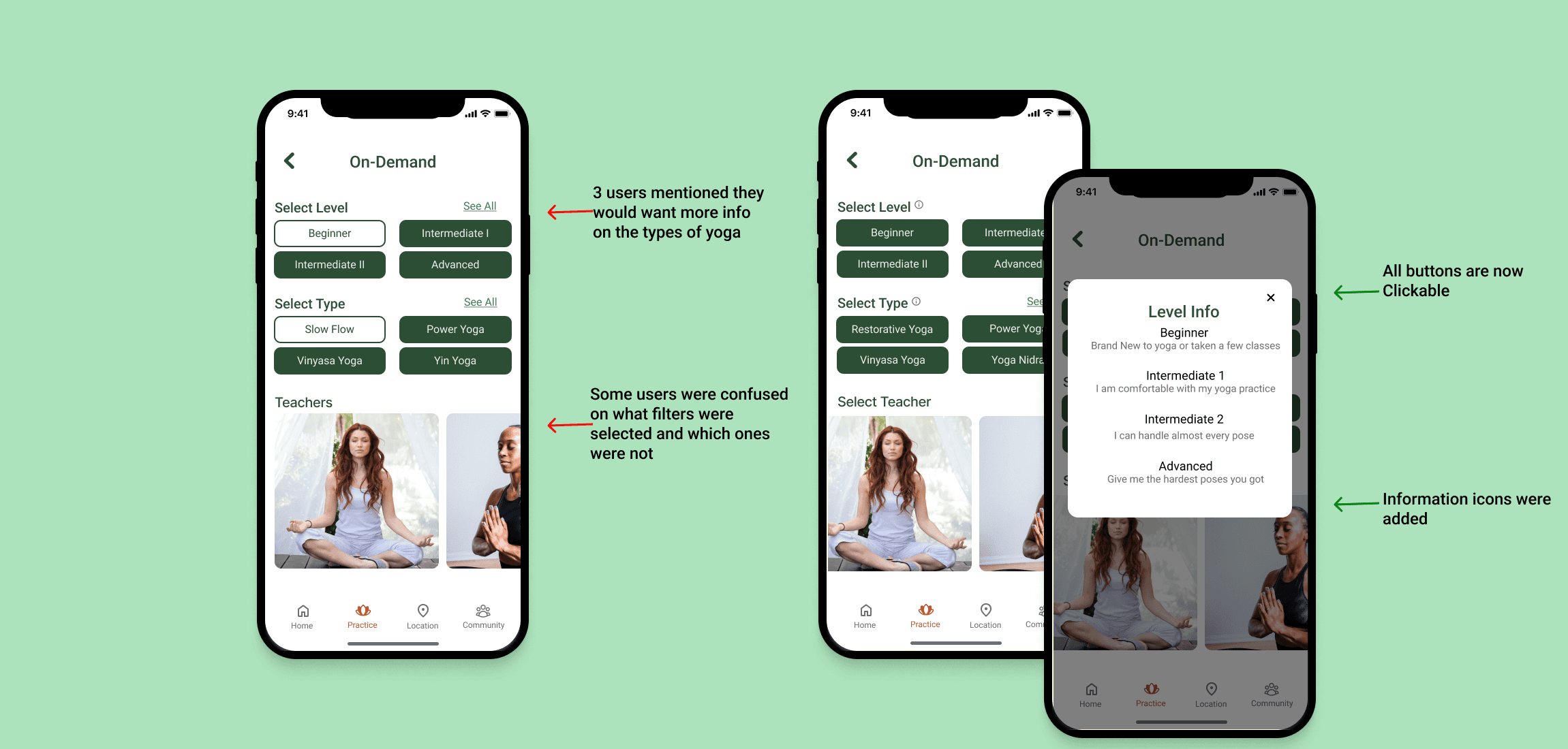
Issue #2
User were confused on buttons
Summary:
Some users were confused on what filters were selected and which ones were not
3 users mentioned that the filters on the location page felt limiting
Users also felt that the filters on the on demand page were limited
Recommendations:
Clarify colors of what buttons are selected and are not
Add filters for ratings
Add see all option or toggle option to list filter types
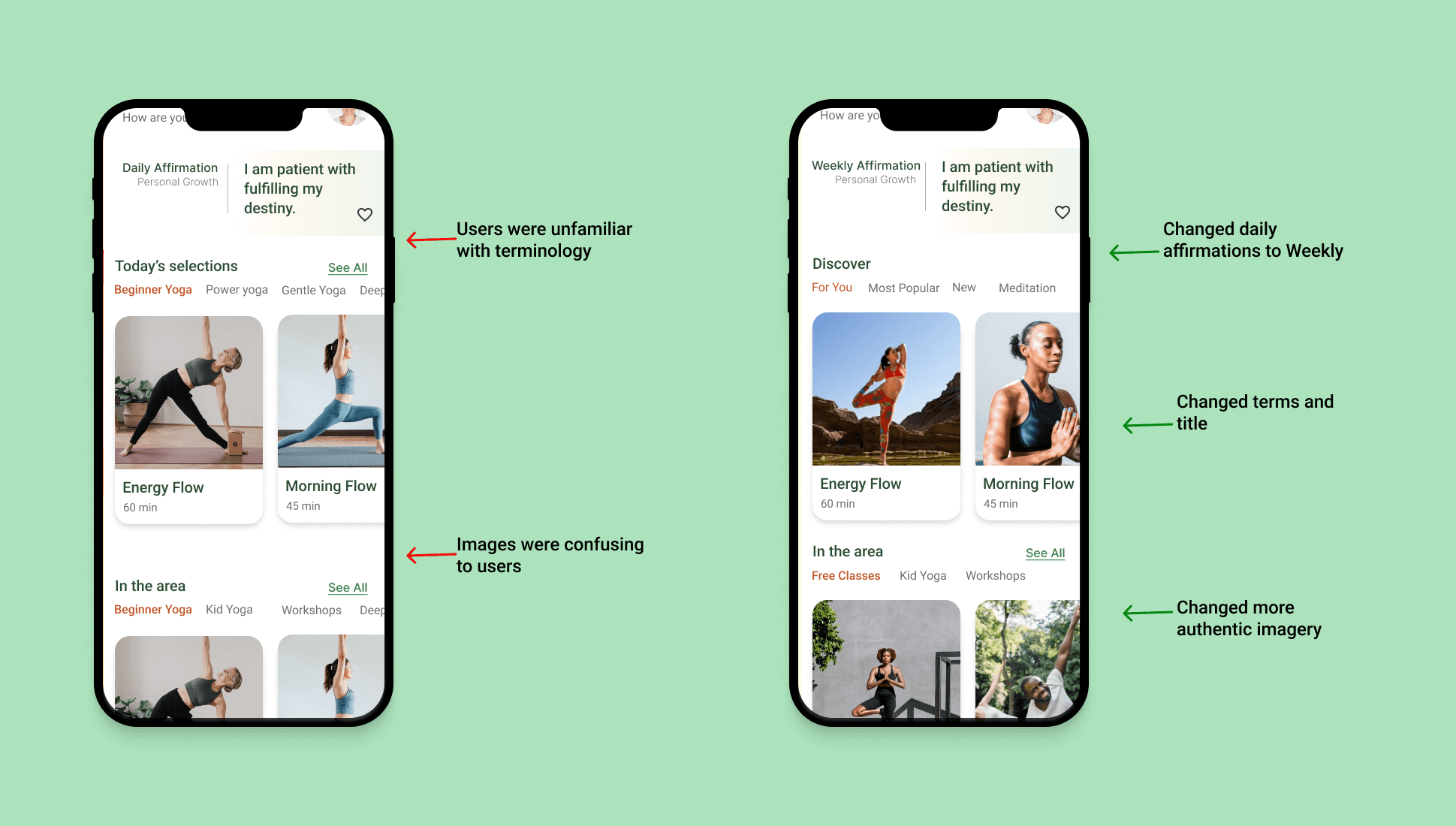
Issue #3
Some terminology and images were confusing to users
Summary:
3 of the 5 users did not know the yoga type terms
Users suggested weekly affirmations on homepage
Yoga terms on the homepage were also confusing to most users that were at the beginner level
Recommendations:
changed "power yoga" line to "recommended for you"
Simplify wording and change photos
Add info hover to let user know what the word means
Translating sketches into Figma wireframes, I laid the foundation for my app's experience. Playful details like image placeholders and buttons filled the screens, while I tackled dynamic elements like scrolling and modals, eager to master the craft.
High Fidelity & Prototype
Polished to perfection: Iterative testing of high-fidelity screens honed visuals and text hierarchy, ensuring user confidence and effortless navigation. Simplicity and clarity reigned supreme. Prototyping in Figma brought my vision to life, enabling seamless interactions between buttons, links, cards, and more. User flows transformed into navigable experiences, aligning perfectly with my testing plan.
Prototype Here!!
Usability Testing
Remote moderated usability tests were conducted with 5 participants, who were asked to:
Find a nearby studio
Start a practice
Create a yoga plan.
I was hoping to discover that the application would be easy to navigate to begin a yoga practice, while hypothesizing the user may struggle with creating a plan and the terminology.
Issue #1
Too many options on creating your own plan screen.
Summary:
All 5 users were overwhelmed by the amount on options to create your plan
Drop downs were not working, so users were confused by some of the terms used
As a beginner, the user did not know how to create the plan
Recommendations:
Delete some drop down options
Suggest a certain plan for different levels
Suggest a certain plan for different body parts (Hips, back, knees, etc.)
Add information rollovers
Issue #2
User were confused on buttons
Summary:
Some users were confused on what filters were selected and which ones were not
3 users mentioned that the filters on the location page felt limiting
Users also felt that the filters on the on demand page were limited
Recommendations:
Clarify colors of what buttons are selected and are not
Add filters for ratings
Add see all option or toggle option to list filter types
Issue #3
Some terminology and images were confusing to users
Summary:
3 of the 5 users did not know the yoga type terms
Users suggested weekly affirmations on homepage
Yoga terms on the homepage were also confusing to most users that were at the beginner level
Recommendations:
changed "power yoga" line to "recommended for you"
Simplify wording and change photos
Add info hover to let user know what the word means
Reflection
Reflection
Reflection
This project has really helped me gain a lot of knowledge, appreciation and a different set of skills. Taking an idea and watching it come to life has been very rewarding ,especially since this topic is a lifestyle of mine and I am very passionate about. I now understand the concept of user centered and how important it is to keep that in the forefront of the process.
If I had more time I would go back and focus more on the user, I believe I stepped out of that just a little bit by focusing more on the design and less on what that goal of the app is for the user. I would also add come pages for the community icon I created to bring it all together.
During the interview process, I definitely learned a lot of what users think and feel as they navigate through these applications and other media outside the phones.
Starting this process I thought I would love researching but I love Designing a lot more. UI has a special place in my heart. I enjoyed the entire process of creating and developing something to make someone else's life easier.